Sunday, 13 March 2011

Magazine Stories

         There are 3 different types of stories that can be used in magazines:
  • Feature
    This is a prominent news story that is written like a short story; it is usually not related to a current event but it can be.
  • News Feature
    This is written as a follow-up or as a sidebar story that is linked to a breaking news event.
  • Timeless Story
    This does not have to be used immediately; this information of this story will be just as relevant if it is saved for a future issue.


    There are many ways of generating ideas to use as a story, these include:

  • News Stories
  • Press Releases i.e. new technology
  • Anniversaries of important events i.e. 9/11, Michael Jackson's death, tsunamis, earthquakes etc.
  • Calender Events i.e. Christmas, Valentine's Day, Halloween etc.
  • Currently goings on; celebrity news, album dates, tours etc.


    Research is important when writing a story and there are many ways of doing so:
  • Internet: the web is used at least once every day per person, it is being used so much that Press cuttings libraries are decreasing and only a few are still in use.
  • Reference books: libraries are good and open to anyone, you can check facts and figures.
  • Press cuttings: most newspapers & magazine groups will operate a cuttings library of some kind, often found online. Press cuttings are everything used in the media, so when researching a specific person you can reference events that have happened in the past. You should use as many as you can, especially when interviewing someone.


    Writing a story
  • The beginning of a story must pull the reader in; the lead (first sentence) but contain a hook (something that appeals to the reader and must make them want to read on), and it should also set the tone of the feature. 
  • There should be at minimum one half direct quotes - should try to paraphrase as much as possible.
  • Final paragraph - should complete the story, refer back to the lead or use a quote to refer to the future.
  • Standard story (news)/basic news lead - needs to include who, what, when, where, why & how of the story.
  • A standard feature's is supposed to draw the reader in - make them curious and make them wonder why?
  • Here's an example, I thought of:
    'Paris Hilton has launched her new album 'Paris' and another new clothing range' but then being arrested for alleged possession of crack cocaine after being stopped in her car.

Thursday, 10 March 2011

Stages: Music Magazine Front Cover

This is my finished front cover for my music magazine.
My last step was to include a footer bar and chose to have it as an 'INCLUDES' bit, with names of big bands of today that would be included in my magazine. I did this by using the 'type tool', then 'fill' and 'stroke' tools once I had typed all of my bands out so that I could apply my colour scheme colours. I chose to do my 'INCLUDES' part to have a red outline instead of a magenta outline, simply so that an audience could tell that it was introducing the bands in my footer bar. I then rearranged my footer bar with the 'selection tool' and placed it on the bottom of my magazine cover, like most magazines, and next to the bar code.

I had the majority of important elements on my document at this stage, my next option was to include a main cover line and several coverlines. The majority of my coverlines were inserted by just using the 'type tool' and then the 'fill' and 'stroke' tools to include the colours and outline colours, all of which still go by my colour scheme of red, black, white and magenta. My coverlines are all information about my band 'Noize' and either under or next to an image of them, using the 'selection tool' to rearrange and place them. They are only one or two sentences long but include vital information that an audience would want to know what is in my magazine. As much as the coverlines on my music magazine do not stand out as much as other elements, they are still noticeable and all in Stone Sans ITC TT bold font.
I added a magazine header bar for my next step, as I needed to include one like most magazines. I couldn't decide what to have as a header bar so I decided to have a prize winning magazine header bar. 'Win! Free gig tickets for a whole year! Win!' was my decision and I did this by using the 'type tool' and having it 'forward' so that it was over my red box. The font for my magazine header bar is the only text that is not Stone Sans ITC TT but instead, I chose DS-DIGITAL font so that it would be more striking for the audience. I chose a red box and white font as it not only stood out from the magazine, it still worked with my colour scheme. I inserted the box using the 'rectangle' tool and then 'apply colour' tool and choosing a red colour. Then I used the 'selection' tool and rearranged and placed it on the top of my magazine. Once I had done that and looked at my magazine properly, I then noticed an empty space which needed filling, so I thought my best bet was to insert a small image of the band by using the same technique as the main image as well as the 'selection tool' to rearrange the image and insert it in the top right-hand corner, just under the magazine header bar.


My next step was to add four very important things; the bar code, issue number, date and price of my music magazine. I added my bar code into the right hand-side corner so that it is easy to notice for when buying the magazine and in a space where I knew it would all come together nicely. I did this by doing the 'copy and paste' technique, then using the 'selection tool' to resize and rearrange it. I then added the date, issue number and price all together using the 'type tool', then using the 'selection tool' to arrange it to go in the top left-hand side of my magazine so that it was parallel to my bar code and easily noticeable. It fits just under my magazine header bar and above the masthead.


This was the start to my music magazine cover.
I chose black as my background as it is one of the colours of my colour scheme and it works well with photographs as well as using outlines in font writing. I came to this decision using my surveys, research, sources etc. I researched other magazines and their backgrounds and came to a conclusion that the magazine that had also used black with the same/similar genres to me, their magazines had a positive outcome and feedback. My survey helped as it also told me that the main colour people had chosen was black. I used the 'rectangle tool' to drag across the A4 page and then the 'apply colour' tool to change the whole page black. 

 
My next step was to add in a masthead that would appeal to my audience, be remembered and give my magazine credit. I had a few problems with my masthead as the more my magazine came together, the more it blended in with it all. As much as it worked well with my magazine, it started to fade and wasn't striking enough anymore. I had to change around the colours quite a lot until I found colours that would make it more appealing and noticeable. The original colour was going to be white with a magenta outline, like my selling point, but I eventually found that red with a white outline was more striking and it still worked with my colour scheme. My colour scheme is now black, white, red and magenta. I used the 'type tool' to insert my text as well as the 'selection tool' to move and rearrange elements on my front cover.  I also did this for my selling line. The font I have used is called 'Stones San ITC TT' in italic and the rest of my magazine will be in this font too, just not as much in italics. I like this font as it has a 'young look' to it and should attract my target audience, which is 14 years old and above. It is also very clear to read, looks nice, not too formal and works well with my magazine once it has all come together.
I then had to move onto my selling line which I wanted to have a 'quote feel' towards it. I had a long think about it, also looking at several musical quotes online and "Music is the rhythm, Lyrics are the rhyme. Sit up, plug in and go" popped into my head. There's a flow when reading it and it speaks the truth because music is the rhythm in songs and lyrics are the rhyme in songs. The "Sit up, plug in and go' bit is basically when a person is to sit up and be ready for the music, 'plug in' is when you have your earphones/headphones or speakers turned on and go is to take in the music. Like the masthead, the font is Stones San ITC TT italic but it is in white with a magenta outline. I did this with the 'fill' tool for the main colour and the 'stroke' tool to include my different coloured outlines.
 

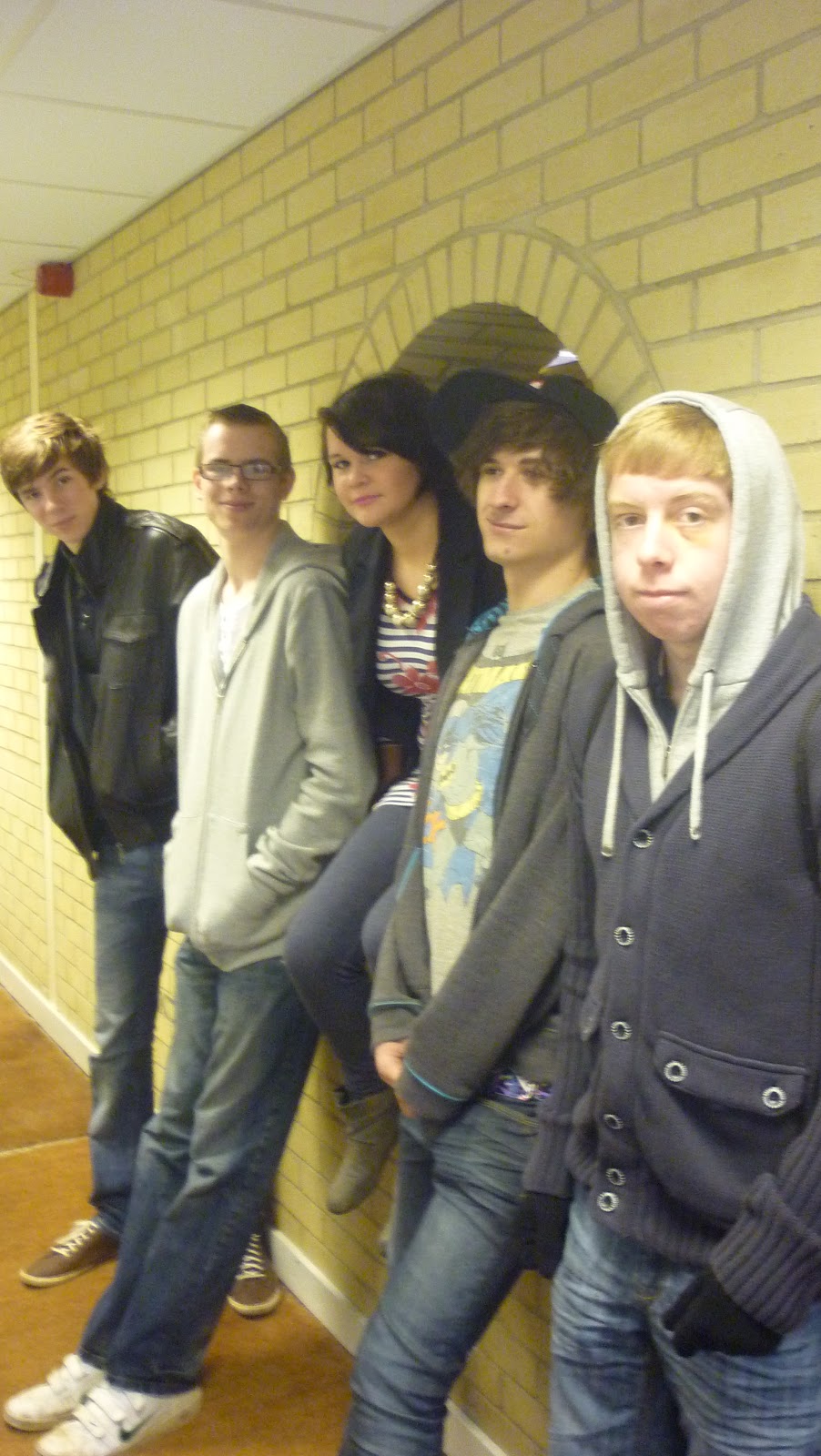
I also added a photograph of the main band featured in my magazine as the main image, like the majority of magazine nowadays. It is right in the centre of the magazine and very noticeable, yet it doesn't distract a reader from any of the coverlines, masthead etc. I chose this image of the band called 'Noize' because it is all of them together and can see each member clearly. I chose to put Ellie i.e. Jasmine at the front as she is the smallest, the lead singer of the band and the only female so she is more dominant than the rest of them, but still does not over shadow the other members. The rest of the band, who are all male, are in a line behind her and you can clearly see them all and their facial expressions. I didn't want a dramatic or posey photograph or anything similar to what most music magazines do, I wanted just a simple and 'smiley' photo that would do each one of them some credit as well as still looking like a new, teenage band. I did this by using 'file' and 'open' so then I inserted my main image, the 'selection tool' also helped a lot as I had to rearrange the photograph several times as well as forcing it to fit correctly on my front cover.


Music Magazine Contents Page

My Finished Contents Page
(with the accidental wrong page number in the call-out quote)

Stages: Music Magazine Contents Page

This was the start of my music magazine contents page.
Like my front cover, I decided to go with black as my background again for similar reasons; it works well with photographs, my colour scheme, my most popular chosen colour in my survey, etc. I researched other magazines for this too and found that the majority of magazines with the same/a similar genre use a black background again. They also had a positive outcome and feedback. Once again, I used the 'rectangle tool' to drag a box across the A4 page and then the 'apply colour' tool to change the whole background to black.
I then added a masthead, the very same one that is on my front cover. I did this as it's technically my magazine's 'logo' and when the audience see it, they'll recognise my magazine. Once again, I used the 'type tool' to insert my masthead text, as well as the 'selection tool' to move and rearrange my masthead on my contents page. Another similarity I have chosen is the font, it is 'Stone San ITC TT' in italic but like I said earlier, the majority of my magazine will be in this font. Continuing with this font, I then included the 'Contents' text which stands out across the black background fairly well as I have used the 'fill' and 'stroke' tools to insert the white text and a magenta outline. I used Stones Sans ITC TT bold font as well as using the same 'type tool' and 'selection tool' to insert the text and place it under the masthead, which is also stands out from.
I then included some of the important elements; the date and issue number of the magazine by using the 'type tool', then the 'selection tool' again to place these and my masthead at the right-hand corner instead this time. I did this so there was a bit of a different, and more room for a band's call-out quote and photographs.

My aim was to include a few pictures of the band in this step of my contents page. I included each one the 'file' tab, then 'open', 'browse' and chose each photo that I had saved onto my memory stick. My first image included, which is my main image, is the same as my main image included on the front cover of my magazine - just with a twist. I have used the image that I was originally going to use, my edited version. I really like this version as you cannot see their facial expressions too well and everything looks pixalized. It also looks like something the band 'Muse' would do, looking back at their 'Supermassive Black Hole' music video, which is good as they are one of the bands inspired by this band. It is also a long shot. It has to be my favourite photograph that I have done throughout the magazine. I then included 2 small images of the band that I may or may not use in my double spread feature as I have plenty of other photographs. I included 3 photographs (2 long shot, 1 close-up shot) of the band as I researched other music magazines contents pages (such as Kerrang!, Rock Sound, NME, etc) and the majority of each contents page had a collection of a few images. I also thought this a really good idea, especially that I could play around with each one on my contents page. In the end, I decided to have them in a group together so that all the text can fit around them, as well as them being the centre of attention. I also think it still attracts my young target audience, especially as it is a full view of the band and they are also young themselves.
I then included a small coverline about the features page, on the corner and on top of the main image, to continue to lure the audience in. It states the page number, the band and says, "An interview & pictures of the gang with info about their first tour!" I did all of this by using the 'type tool', 'selection tool' as well as the 'fill' and 'stroke' tools to include the colour in the font. I chose to use a white font with a black outline so that it would all stand out against the photograph, as it is mainly in several colours. The only thing I changed was the page number and bullet point to have a red outline so they do not blend in as much, easily spotted and can go to that page as well as being different to the rest of the coverline. I think the text targets my audience as I have used slang, i.e. info, gang, etc. so that it is still serious and states the important parts of the feature but also includes a 'edge' to it.

My next step was to insert the pull quote. I chose to use, "He's not all sweet and innocent, trust me. Unless his mum's there, that's a different story. He's a mummy's boy." I researched other magazines and soon realised it's quite long for a band's call-out quote but I decided to keep it. I've kept it because it has a good reader's flow and after each sentence, the audience is 'on edge' to read more. It will also attract my target audience14 years - 25 year olds because it is something young people have said about themselves or their friends time and time again. I think this is the aim of a call-out quote itself, to attract the audience even more, even it means a long suspense. I've made it quite striking too and in a large enough text, still in Stone Sans ITC TT italic. I also used the 'fill' tool to insert a white text, then the 'stroke' tool to apply a red outline. I've done all the colours and outlines different for each text box as I think it'd be too plain, although each colour is still in the range of my colour scheme. It separates each text box but each part is striking in itself. I then included the person who said this quote, Jas Heartly (lead singer of the band) and the name of the band afterwards, like the majority of music magazines do to recognise the person. Underneath I included, "confessions from this teen band" then the page number (which this accidentally says 22 when it's meant to be 33 - I later changed this error) so that my young audience will be intrigued to read as 'confessions' tends to be a word used for secrets in the modern age of today. I did all of this using the 'type tool' to insert the text, the 'selection tool' to rearrange and place the elements, and then the 'fill' tool to include the white text and the 'stroke' tool to have a magenta outline. All of which was also in Stone Sans ITC TT but bold so that the quote looked even better in italic.


One of the most important parts to include in a contents page, as researched from other magazines and from what we've learnt in our Media lessons, is the features and news sections. I chose to have these positioned on the right-hand side, under my masthead, title, and date & issue number as well as next to my photos. It fits well and is easily spotted on my contents page, the majority of music magazines also do this - may not be positioned the same but arranged similarly. My aim was to have all of my text work around the images so that it all fit nicely one the page and presented well.
My 'News' would supposedly update every week and include news about different bands of my genre/s whereas my 'Features' would also include different bands each week but each would have their own few pages about the band, what they've been upto, etc. Only one of these bands would have a double spread feature interview though and would have the entire magazine front cover and contents page based on them, and in my case, this was 'Noize'. This would also be updated each week. I chose to do this so that my target audience might be introduced to new bands, or even feel differently of bands they had heard of but haven't listened to, or even disliked in the past. Even if some of my audience continue to dislike the main band mentioned in my magazine in whatever week, there is still all sorts of information on other bands and other stuff to read about.
I also included each page number and gave each band 2 pages. I insert the text using the 'type tool', rearranged and placed the text box using the 'selection tool' and I then used the 'fill' and stroke' tools to include the colours. The colours used are still in my colour scheme, just used differently for different parts. I did each title in a white font, with a magenta outline (and made sure they were also in a bigger font than the page numbers and the rest of the text so that they are recognisable as titles) whereas the bullet points and bands a white font with a red outline, and the page numbers were all in white, they were also a slightly bigger size to the rest of the text. I still continued to use 'Stone Sans ITC TT' bold font for this section.


Now my last job was to include a regulars sections, like the majority of magazines also do too. I thought long and hard what was best to include in it so that it would still attract my target audience and they wouldn't get bored. I decided to include the best options that my young target audience would love to know most about; gigs, merchandise, (stereotypically speaking, gigs/concerts and shopping are two of the main activities my target audience favour and it is something for both sexes and all sexualities) writing to my magazine, horoscopes and wordsearches for their entertainment at the end. 'Sing to Lyric' has a catchy edge to it and I know that several young people really enjoy writing, texting and e-mailing their favourite magazines to share their thoughts, experiences, memories, etc, so I thought this was something nice for young people to get involved in and enjoy the magazine a bit more knowing this. Also, several young people of today follow up on their horoscopes so I thought, why not? Reading a horoscope each week is fun, even if it's not for everybody or not even true it's still there to have a laugh with - I assume this will target females more than males though, judging my young people of today and my survey. Wordsearches are always fun to do, of all ages, and can keep a person occupied now and again. There will be about a page of wordsearches that contain bands, genres and music in general. This could also encourage my audience to listen to new bands or new genres if they haven't heard of them before. It is fun as well as educational, in a way.
Like my features, I used the same font and colours for each text as that. I did all of this using the 'type tool' to insert my text, the 'selection tool' to rearrange and place each text box as well as the 'fill' and 'stroke' tools to include my colour scheme.

My Survey &Results

We designed our own surveys in class to help design our own music magazine. Our homework was to have at least 20 people do the survey so that we had something to work from at the start. I managed to have 28 fill in my survey which helped a lot. The results I got were;


My first question was what gender the person was, it was halved between male and female exactly.

My second question that I asked what age the audience that did my survey were; the majority were between 16 and 18.


I then asked on my survey whether or not they read magazines, I thought this a vital questions and unfortunately the majority said they didn't. 

Next I asked what people thought of my magazine title, another vital question. Unfortunately 1 person thought it 'Very Poor' but the majority thought it was 'Good' so I stuck to it.


Another important question that would help design my magazine was the choice of a colour scheme. A lot of people said Green, Purple and Black but I decided to alter it a bit because a lot of rock/emo/alternative music magazines use this colour scheme too. I decided on Black, Red and Pink/Magenta.

Last question to ask was about the cost of my magazine. I asked on my survey what people thought would be the right price range for my magazine and the majority voted for £2.50.

Friday, 11 February 2011

Music Magazine Cover

Finished Front Cover
Thought-to-be finished cover, then changed masthead.

Photos for music magazine

I'm still debating over whether to use this image in my contents page; I may use it for a small image in my feature or not use it at all. There are pros and cons to this image; I like that there is a 'glow' but at the same time I dislike that you cannot identify any of the members and that it's another risky photograph. I made A LOT of changes to this image, I was mainly fiddling around with Adobe Photoshop but thought it rather 'cool'. I used the curves tab, like most of my images, and  had to edit the colour balance, decreased the yellow due to the yellow wall background overpowering the band members. I then clicked onto the filter tab and went onto style and had different options to choose from. I tested several out until I came across glowing edges and decided to stick with this. I changed several of the levels, they were;
Edge width: 2
Edge Brightness: 11
Smoothness: 11


                                              The original Front Cover Image - before any edits.


This is my magazine's front cover. I chose this as my rebound photo as it is the original (plus edits) of the image I was originally going to have and used Adobe Photoshop for this too. I really like this photo as it has all the band together and it's quite professional, something you'd expect a band you look like. I chose the 4 boys to stand behind the girl (lead singer) as it seems this position seemed the best choice. I really like that the girl, Ellie, stands out as she's the vocals of the group and the 'front-woman'. I didn't want anything to posed or dominant-looking so I asked for a simple 'smile' approach. I made several changes to the image because the lighting, brightness and straightness was terrible, especially because of the weather and the type of camera used. The levels changed were;
Brightness decreased (-65)
Contrast increased (+41)
Colour balance: cyan = 3  magenta = -2  yellow = 0


This was originally going to be my front cover but I then decided to use it in my contents page instead. The reason for this is because it was too different and a bit of a risk to take, most magazines use a normal and clear photograph of an artist or band. I edited this on Adobe Photoshop to get the effects I wanted. I did this by using the Filter tab, went onto the Artistic option to then find several choices of effects I could choose from. In the end, I chose Cut Out which is what gave it this blurry/artsy feel. Again, I first changed the curves and I also chose to edit the levels quite a bit. They were;
Number of level = 6
Edge simplicity = 6
Edge fidelity = 2
The reasons as to why I really like this image is because it's quite different. I like the fact there are no distinctive identification on any of their faces. It has a nice effect and looks like something Banksy would paint. This relates to Banksy's identity pretty well as well as my band 'Noize'. Not the fact they do not want people to know who they are, simply because they're a group of rebellious teens like him. Also, this is something I would imagine the band Muse to do, judging by their 'Supermassive Black Hole' music video of the masks and suits. This also links well with 'Noize' as Muse is meant to be one of their inspirations.