Friday, 11 February 2011

Music Magazine Cover

Finished Front Cover
Thought-to-be finished cover, then changed masthead.

Photos for music magazine

I'm still debating over whether to use this image in my contents page; I may use it for a small image in my feature or not use it at all. There are pros and cons to this image; I like that there is a 'glow' but at the same time I dislike that you cannot identify any of the members and that it's another risky photograph. I made A LOT of changes to this image, I was mainly fiddling around with Adobe Photoshop but thought it rather 'cool'. I used the curves tab, like most of my images, and  had to edit the colour balance, decreased the yellow due to the yellow wall background overpowering the band members. I then clicked onto the filter tab and went onto style and had different options to choose from. I tested several out until I came across glowing edges and decided to stick with this. I changed several of the levels, they were;
Edge width: 2
Edge Brightness: 11
Smoothness: 11


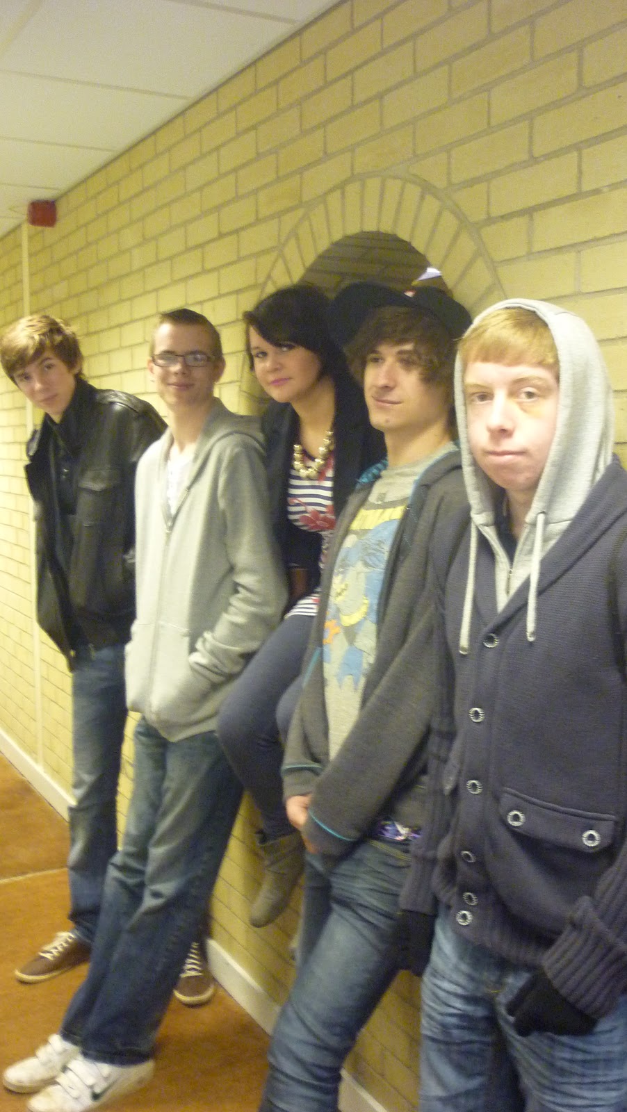
                                              The original Front Cover Image - before any edits.


This is my magazine's front cover. I chose this as my rebound photo as it is the original (plus edits) of the image I was originally going to have and used Adobe Photoshop for this too. I really like this photo as it has all the band together and it's quite professional, something you'd expect a band you look like. I chose the 4 boys to stand behind the girl (lead singer) as it seems this position seemed the best choice. I really like that the girl, Ellie, stands out as she's the vocals of the group and the 'front-woman'. I didn't want anything to posed or dominant-looking so I asked for a simple 'smile' approach. I made several changes to the image because the lighting, brightness and straightness was terrible, especially because of the weather and the type of camera used. The levels changed were;
Brightness decreased (-65)
Contrast increased (+41)
Colour balance: cyan = 3  magenta = -2  yellow = 0


This was originally going to be my front cover but I then decided to use it in my contents page instead. The reason for this is because it was too different and a bit of a risk to take, most magazines use a normal and clear photograph of an artist or band. I edited this on Adobe Photoshop to get the effects I wanted. I did this by using the Filter tab, went onto the Artistic option to then find several choices of effects I could choose from. In the end, I chose Cut Out which is what gave it this blurry/artsy feel. Again, I first changed the curves and I also chose to edit the levels quite a bit. They were;
Number of level = 6
Edge simplicity = 6
Edge fidelity = 2
The reasons as to why I really like this image is because it's quite different. I like the fact there are no distinctive identification on any of their faces. It has a nice effect and looks like something Banksy would paint. This relates to Banksy's identity pretty well as well as my band 'Noize'. Not the fact they do not want people to know who they are, simply because they're a group of rebellious teens like him. Also, this is something I would imagine the band Muse to do, judging by their 'Supermassive Black Hole' music video of the masks and suits. This also links well with 'Noize' as Muse is meant to be one of their inspirations.

Tuesday, 18 January 2011

First lesson we started our Music Magazine.

We've recently started our music magazine coursework and after planning, giving our surveys etc, we finally started the front cover in class. My music magazine will be called 'Lyric', contains artists in the rock/alternative genre, aimed at both sexes and potentially for 14 years old and over. We're all using 'In Design' to design our music magazines and it's gradually getting easier to understand the program, especially the more we use it.

I've currently only got half of my front cover done as all I need is some photographs to add so then I can include my features and cover lines too so it all fits. I made my background black, my font white as well as a 'pink/purple' over glow. I added the 'over glow' using the effects on the edit/tool bars. The reason I also used this colour scheme as it got the most votes in my survey, despite the fact I was hoping to at least use black and white anyway. My masthead is large, white, with an over glow of pink/purple and in italics. I may change the pink/purple colour scheme though incase it looks too feminine as well as the font if it all doesn't stand out or fit nicely. I've also used the same colours for my selling line and the words, "Music is the rhythm, Lyrics are the rhyme. Sit up, plug in and go." hoping to attract the audience, although I may change it later on as well as the font used. I've also included the bar code, the issue number and the skyline. I also helped a few people in the class about how to use tools and colours which educated myself even more!

Thursday, 6 January 2011

Audience Research

I have created a survey about my music magazine 'Lyric' for 20 people to fill out and collect data.
The aim is that I have 20 responses from all different types of people, i.e. age, gender etc, so that it gives me more suggestions/ideas on how to improve my magazine. I also receive information from these people, judging by the answers in my survey, about what they assume/think my magazine will be like from their own perspective.

I created my survey on 'www.surveymonkey.com' which had a selection of different types of sample questions. I commonly used an essay box so that I could receive suggestions/comments from the surveyors and an example of this was a question about what musical artists they expect to appear in my magazine. Other questions used were called multi choice questions, ratings and open comments which gave a surveyor more of an opportunity to write their own personal opinions or suggestions. The sample I will be using to complete my survey will be to several friends and family, also notifying them to take this seriously. This means that my survey could be bias as they are people I know and don't want to be too critical.

My survey link is: http://www.surveymonkey.com/s/W9ZJRNN

Wednesday, 1 December 2010

Research & Planning: Comparisons with other music magazines

'Lyric', my own designed magazine, is quite similar to the magazine I am comparing it with. This was not intentional but I will probably make some alterations so that there are much more differences. 'Rock Sound' is a rock/emo/alternative genre based magazine that has an audience of teenagers+ and particularly the white race. Although my magazine is a rock/alternative genre, music is changing so much in this generation that 'emo' may slip into it the category, depending on publicity and fame. I have also aimed for my audience to be 14 year old+ and will most probably attract the white race as the majority of white people listen to these types of music. Although, I want it to be of a wide range and any race can read it but everything is stereotyped nowadays.

I have planned to have my front cover's main colour scheme as black, white and blue whereas once again, Kerrang is very similar. Fortunately, Rock Sound change the colour scheme of their front covers most weeks but they have used black and white a fair few times. I have looked at many of their magazines and they change weekly; one week it'll be a theme of black, white & yellow, the next it will be white, green, black & yellow whereas another week it will be blue, red & white etc! I, on the other hand, would personally keep Lyric with the same background every week even though Rock Sound have used a very clever and eye catching technique by changing the cover several times. The advantages would be of keeping the readers interested, guessing what the colour schemes would be next and Rock Sound can relate the colours to the features of the main bands. The disadvantage is that because it changes so often, the audience would not be able to identify the magazine very easily. 


I also want a big, bold heading of my magazine's name whereas Rock Sound have theirs this way too. The difference would be that I would prefer mine to be grammatically corrected with a capital L and the rest of the letters lower case whilst Rock Sound has chosen to have it's name in all capitals. This is a good way to have it as it's eye-catching and very bold but quite boring at the same time. Also, their main images overlaps their heading and I want to have 'Lyric' at the front and nothing to overlap it or for it to overlap the main image either - this is also an example of an editing style. Other editings made are of images tilted to the side, jaunty and different angles that you would not expect which I hope to use in the future with my own magazine.


Rock Sound contains several advertisements, reviews, features and images just like I hope my magazine will contain. More images that are contained are big and 'in your face' so that the audience is able to see some of the best pictures of those bands and the language used attracts the audience to read on and buy more magazines. I hope to use both these techniques in my magazine so that it comes out in the best quality. The features and reviews, in Rock Sound magazine, also take up a few pages which is what I am hoping to do with my own magazine as well as sections for the advertisements. It gives the audience a pull perspective about the bands and due to having a large amount of space, gives an excuse for the magazine to get as much information about them as possible.