I'm still debating over whether to use this image in my contents page; I may use it for a small image in my feature or not use it at all. There are pros and cons to this image; I like that there is a 'glow' but at the same time I dislike that you cannot identify any of the members and that it's another risky photograph. I made A LOT of changes to this image, I was mainly fiddling around with Adobe Photoshop but thought it rather 'cool'. I used the curves tab, like most of my images, and had to edit the colour balance, decreased the yellow due to the yellow wall background overpowering the band members. I then clicked onto the filter tab and went onto style and had different options to choose from. I tested several out until I came across glowing edges and decided to stick with this. I changed several of the levels, they were;
Edge width: 2
Edge Brightness: 11
Smoothness: 11
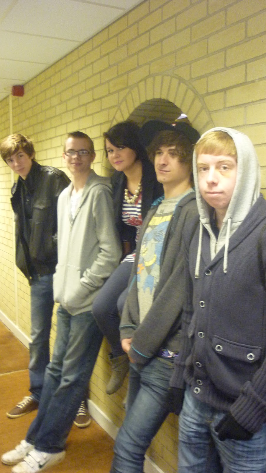
The original Front Cover Image - before any edits.
This is my magazine's front cover. I chose this as my rebound photo as it is the original (plus edits) of the image I was originally going to have and used Adobe Photoshop for this too. I really like this photo as it has all the band together and it's quite professional, something you'd expect a band you look like. I chose the 4 boys to stand behind the girl (lead singer) as it seems this position seemed the best choice. I really like that the girl, Ellie, stands out as she's the vocals of the group and the 'front-woman'. I didn't want anything to posed or dominant-looking so I asked for a simple 'smile' approach. I made several changes to the image because the lighting, brightness and straightness was terrible, especially because of the weather and the type of camera used. The levels changed were;
Brightness decreased (-65)
Contrast increased (+41)
Colour balance: cyan = 3 magenta = -2 yellow = 0
This was originally going to be my front cover but I then decided to use it in my contents page instead. The reason for this is because it was too different and a bit of a risk to take, most magazines use a normal and clear photograph of an artist or band. I edited this on Adobe Photoshop to get the effects I wanted. I did this by using the Filter tab, went onto the Artistic option to then find several choices of effects I could choose from. In the end, I chose Cut Out which is what gave it this blurry/artsy feel. Again, I first changed the curves and I also chose to edit the levels quite a bit. They were;
Number of level = 6
Edge simplicity = 6
Edge fidelity = 2
The reasons as to why I really like this image is because it's quite different. I like the fact there are no distinctive identification on any of their faces. It has a nice effect and looks like something Banksy would paint. This relates to Banksy's identity pretty well as well as my band 'Noize'. Not the fact they do not want people to know who they are, simply because they're a group of rebellious teens like him. Also, this is something I would imagine the band Muse to do, judging by their 'Supermassive Black Hole' music video of the masks and suits. This also links well with 'Noize' as Muse is meant to be one of their inspirations.